

Jim Krause | Classes | P354/J560 Program Graphics & Animation
Week 1
Agenda:
- Course Introduction
- Pre-test
- Graphics overview, theory & application
- Intro to Photoshop
- File/pixel sizes
- Color Modes
- Play with Photoshop
What this class is about:
In P354/J560 you’ll be making graphics and animations for television and digital filmmaking projects. By the end of the semester you should have built a portfolio of graphics and animations.
This is a production class, focusing on the tools and techniques used to make graphics and animations. The main tools used will be Photoshop and After Effects.
Review syllabus, schedule, critique forms & assignments
For all homework, keep the design of your work 100% original and maintain legal integrity. While there are times that it's appropriate to incorporate existing artwork into a project (E.g. Working on a client project for an organization), your projects must highlight what you can do- not what others have done. You must rely on your own creativity and design skills- not existing images and clip art.
Examples:
- Before Angels by Morgan Anderson
- Fun Facts ABout UAVs by Var Brynildssen
- HH Landscape ad by Kyle Hicks
- The Cave by Jacob Krutulis
- How to Reverse an Overdose by Bella Romaine
- IUOA promo by Alec Dietz
- My Prayer by Emma Garcia
- Recuing Carbon Emmissions by Chris Berkel
- Space Facts by Drew Daniels-Rosenberg
- Student Cinema Guild promo by Madelyn Knight
- WTIU promo from Jill Moore
Take the Pretest
Student introductions
A Little Context
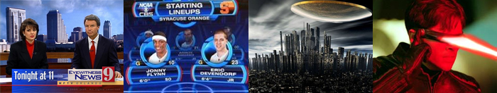
What are we looking at when we see graphics in TV and film? Possibly, keyed graphics (which occupy only a portion of the screen), sports stats, spaceships, or special effects....
What and How
For live production - Tools range from character generators to data-driven 3D renderering systems (Inscriber, Vizrt, WriteDeko, Chyron/Lyric, Piero, etc.) are used. Simple character generators provide real-time support sequencing of graphics, while more powerful 3D rendering systems allow for real-time overlaying of graphics in 3D space.
For postproduction - Image processing, paint and drawing programs let users create new and process existing artwork. ( Adobe Illustrator, Corel Draw, Photoshop, etc.). Photoshop is likely the most useful and used software in the world of web, print, multimedia and video. (If you are serious about graphics and design, your time learning Photoshop will be well-spent.)
3D modeling & layout programs let you create 3D objects and animate them in 3D space. If you see an object from alternate sides, chances are good it was made in a 3D program.
Movies like Star Wars, X-Men, etc. rely on programs like Lightwave, Maya, Softimage and 3D Studio Max to create the ships, people and places. But it's not just for sci-fi. More and more productions are using 3D to create organic, or real-life looking places, animals, and people.
Compositing and motion graphics software (such as After Effects) allow users to composite multiple types of graphics and create special effects. For example, actors shot against a green screen could be superimposed onto a rooftop deck, behind this a city skyline, and then behind this a night sky.
Compositing and animation programs also allow for the creation of new elements.
Color
Color can be objectively described in a number of ways. One of the most common methods is using the HSB model:
Hue (the actual color)
Saturation (the strength or intensity, or how far it’s removed from gray)
Brightness (how dark or light)
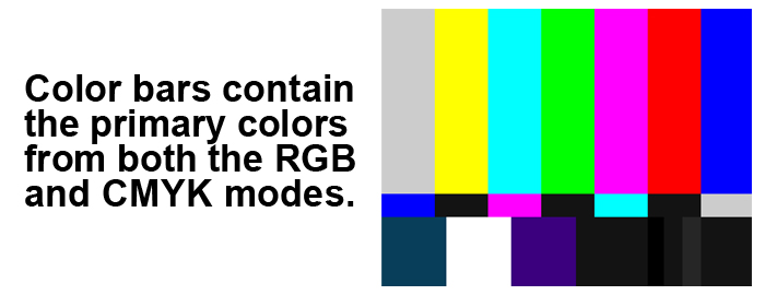
Color Modes
But you can also describe color in other ways- depending on what color mode you are working in. Two color modes you should be familiar with are:
Additive Color (RGB)
Subtractive Color (CMYK)
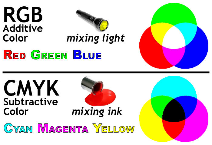
Additive Color is the color system used for computer graphics, TV and lighting design. This is the color mode used to create graphics for TV and web. It's referred to as additive since lights are mixed or combined to make the various colors.
- Red
- Green
- Blue
The primary colors (think of them as light sources) are:
Mix them together and you get white.
Subtractive Color is the color system used for printing. It's referred to as subtractive because the colors absorb (subtract) some light and reflect others.
- Cyan
- Magenta
- Yellow
The primary colors (think paints or inks) are:
Mix them together and you get black. (K stands for "key" or black plate.)
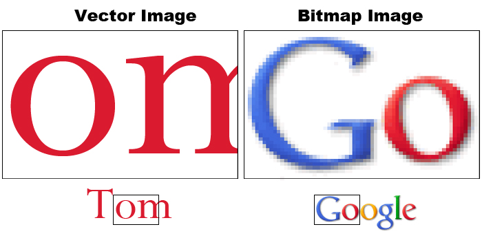
Bitmap and Vector graphics
Bitmap or raster images, use a grid or array of pixels to represent an image. The grid is made up of squares or pixels. Each pixel is given a specific color and brightness. If you enlarge a bitmap graphic, you will eventually see the grid.
Photos you take with your phone or DSLR, scanned images, and captured video frames are examples of bitmap graphics.
Vector graphics are made up of shapes, lines and curves that are defined mathematically.
When you draw a circle or create a piece of text with a vector-based application (such as Adobe Illustrator), it keeps track of the lines and angles that make up objects. From this mathematical data, it draws the display. We can scale a piece of vector artwork up to any size, and it will still retain its quality.
Fonts or typefaces are examples of vector graphic objects. You can scale fonts up as much as you want and the edges will never become jagged.
Anti-aliasing
You can turn this feature on and off. It produces intermediately shaded pixels to smooth out the appearance of jagged edges. Note the anti-aliasing which is apparent on the enlarged image on the right hand side.
Text
Text is the most important element used to convey information in graphics. Whether a lower third, the price of a product, stock market figures crawling across the screen, or the final scrolling credits at the end of a production, knowing how to properly use text is essential to graphic production.
It's also possible to make compelling pieces of art based primarily on text. Check out these examples:
- http://vimeo.com/3829682 ("Like, you know" written by Taylor Mali)
- http://www.youtube.com/watch?v=6mnvvVi4HaI (based on Lock, Stock & 2 Smoking Barrels dialog)
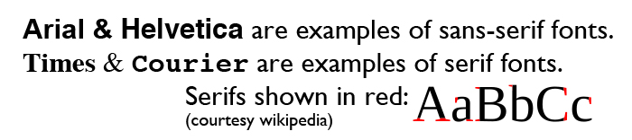
Serif and Sans-serif
Serifs are small details found on the end of some fonts. In typography we can describe a font as either serif or sans-serif. (Sans means without.)
Arial and Helvetica are examples of sans serif typefaces.
Times and Courier are examples of seriffed typefaces.
Typographers generally believe that large blocks of text are more easily read by using a seriffed typeface. This is why books, newspapers and magazines primarily use seriffed typefaces in the main body of text.
Tracking, kerning & leading
Tracking refers to the horizontal spacing of an entire group of letters on the same line.
Kerning is the space between individual letters. For example you’d want to kern a small case letter “o” to fit underneath the capital letter “T”.
Leading (pronounced like bedding) is the vertical spacing between lines of text.
![]()
File Formats:
Photoshop lets you work on and save in a number of different color modes and file formats. If you open a file in Photoshop and select "Save As" from the file menu, you will get a screen similar to this:
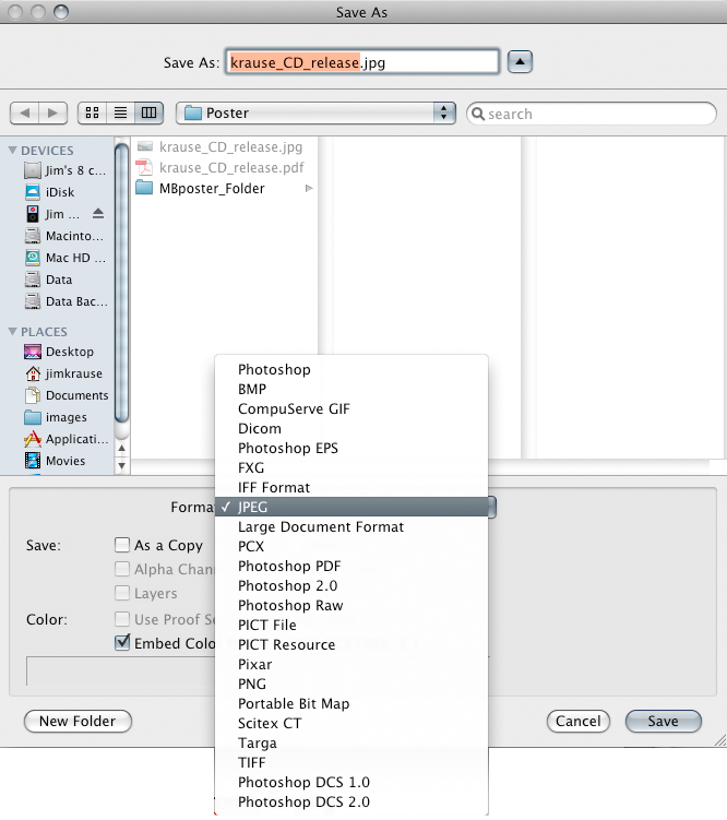
- Photoshop (.PSD) is the default file format and can support multiple layers and alpha channels.
- BMP (BitMaPped) is a Windows compatible image format (supports alpha channels)
- Compuserve GIF (Graphics Interchange Format) only supports up to 256 colors (web-friendly & supports alpha channels).
- Dicom (Digital Imaging and Communications in Medicine) is a standard for viewing and viewing medical imaging files.
- EPS Encapsulated PostScript: Can describe both vector & bitmapped
graphics.
Support by virtually all page layout and desktop publishing programs - FXG (Flash XML Graphic)
- IFF (Interchange File Format) was developed by Electronic Arts
- JPEG: (.JPG) Joint Photographic Experts Group: uses variable compression (*lossy).
(Web-friendly but no alpha channels.) Does support 24 bit (true) color.
- * Lossy vs lossless: Whenever you open something (like a JPEG) and save it again it loses some detail. This is know as lossy.
- PCX (Personal Computer eXchange): PC based image format developed for PC Paintbrush
- Photoshop (.PDF) Portable Document Format: Used by Adobe Acrobat. No alpha channel support. Notable as it's widely used for both web and print.
- Photoshop Raw: A format with unprocessed (raw) data from digital cameras and film scanners.
- PICT (.PCT) - Was widely used on Macs (Supports 24-bit color and alpha channels) but fallen out of favor.
- Pixar: graphic file type developed by Pixar
- PNG (Portable Network Graphic): Supports 24 bit color. (web friendly - supports alpha channels)
- Portable Bit Map: A format designed to facilitate transfering of B&W images via ASCI text
- Scitex: Developed for Scitex equipment used mainly in desktop publishing.
- TIFF (.TIF) tagged image file format: Widely used by all image apps (Supports alpha channels)
- Targa (.TGA) Video format designed around Targa cards. Supported by most PC-based graphic applications. 32-bit color. Supports alpha channels.
- Photoshop DCS (Desktop color separation) based on EPS fiels, used for desktop publishing.
(File formats in bold are commonly used.)
Message
Graphics are a form of visual communication. They convey a message. TV graphics should be clear and easy to understand.
The graphics we make in this class should have a purpose or a message. We are focused on Applied Art, not Fine Art.
Aesthetics
Understanding of the tools (E.g. Photoshop & After Effects) is great but not worth much without a working knowledge of design and composition. The TV graphics we make should look good, but what is “good?” What makes up a pleasing composition?
There are creative design principles that have been developed over the years in regard to visual composition, which can be described as the orderly arrangement of elements within a scene. The same rules that apply to classic art similarly can be applied to our TV/film graphics.
Subjective and objective analysis for judging the aesthetics of TV graphics is weak. While personal opinions will always vary, I’ve identified some general guidelines that serve as a good starting point.
Make sure you are familiar with Jim's Graphic Guidelines!
For those looking for a good visual design book I recommend Robin William's Non-Designer's Design Book. This is a wonderful, inexpensive primer on how to approach layout. Four basic principles include:
- Contrast
- Repetition
- Alignment
- Proximity
Some good examples to ponder:
http://www.creativebloq.com/graphic-design-tips/information-graphics-1232836
Thursday
Photoshop Tour
- Main interface
- Tools (keyboard shortcuts, foreground background etc)
- Tool option bar
- Windows (remember the small arrow on right hand side)
- Navigator, options, info
- Swatches, colors, brushes
- Layers, channels, paths window
- Preferences: pixels are more helpful than inches
- Color modes: Use RGB for video/web graphic work
- Color picker
- Layers (making new, merging, rasterizing,)
- Text (kerning, leading, tracking baseline shift)
In-Class Photoshop Exercise - 5 points
Create a 1920x1080-sized TV graphic that promotes a show or event, or has some specific purpose. Be sure to use the following criteria:
- Use only a few colors from a single palette selected from W3 Schools or Color Hunt. Most eye-catching graphics use only a few colors that work well together. You can come up with variations on a color by varying the amount of saturation and brightness.
- Use only shapes (circles, squares, etc.) and at least two separate text elements.
- Follow the technical guidelines in Jim's Graphic Tips. Can you put the principles of CRAP to work? (Contrast, Repetition, Alignment, Proximity)
- Turn in a full-size JPEG copy of your graphic (JPG) and the original (PSD) via Canvas. Be sure to save both files named as your username. (I.E. jarkraus.psd & jarkraus.jpg)
A note about working with layers and saving copies- Always keep your original layers intact. You may need to manipulate these later & make changes. You can flatten copies for display or distribution.
Optional exercises:
If you are unfamiliar with Photoshop, work through some optional exercises. There are excellent tutorials on Lynda.com. There is a tour of the interface in the Photoshop CS Help PDF. There is also a good tour in the "help" section. If you have PS Classroom in a Book, work through “Tour” and “Working with Selections” tutorial. “Layer Basics” is also a good introductory exercise.
Vocabulary (know these)
- Anti-aliasing – You can turn this feature on and off. It produces intermediately shaded pixels to smooth out the appearance of jagged edges
- Bitmap & vector graphics
- CMYK (subtractive) color mode
- Kerning –Adjustment of the space between a pair of letters on the same line. Proportional fonts typically "auto kern". In this manner a small letter o can be tucked under the top of the capital letter T (To). Most design programs let you adjust the kerning between two characters by positioning the cursor between them and then holding down the option key while pressing the left/right arrow key.
- Leading – the space between different lines of text
- RGB (additive) color mode
- Sans-serif type
- Serif type
- Tracking - similar to kerning in that it is a control of horizontal spacing. However tracking controls the spacing of a entire line of text, not just a pair of characters.
Homework (due next week by the start of lab):
- Burrows & Wood reading (Chapter 10 PDF file)
- Graphic Analysis Homework: In this exercise you will find, describe, and analyze two graphics that are used in TV commercials, titles, segues or promos.
- Scan through a TV/cable network (or Hulu, Netflix, Apple, Disney+, Amazon Prime, etc, to find and capture two examples of graphics that you find pleasing. One should contain simple elements while the other should be complex. The graphics must be from an HD broadcast TV or network stream (not a web banner ad). Using screen capture software, a digital camera, or your phone, grab screenshots of the two different graphics.
- Write a 2-3 paragraph analysis of each of the two TV graphics. Include your JPEG or PNG screen captures. Consider the following: What was its purpose? What colors were used? What can you say in terms of composition, texture, contrast, typeface, foreground or background elements? Were they effective? Were they pleasing to you? Why or why not?
- NOTE: You will turn in your homework via Canvas. It should be in the form of a Word doc, docx, rtf, or PDF.
