

Jim Krause | Classes | P354/J560 Program Graphics & Animation
Lab 3
Announcements & Agenda:
- Share homework & Review Burrows & Wood reading, aesthetics & color
- Photoshop Odds & Ends
- Alpha Channels and Key Graphics
On Turning in Homework:
- For the best grade, follow the assignment criteria & turn in on time
- Getting the message across is #1 priority. Is all the info there? A promo for a TV show or event should have a hook (appealing reason to watch/attend), program title, time, place/network/venue, etc.
- Did you put the principles of CRAP to work?
- Use white/negative space - Us the safe text area for this and don't "crowd" important foreground elements. Do elements have room to "breathe"?
Burrows & Wood reading (review of chapter 10 from Television Production Disciplines and Techniques)
Three fundamental aspects of pictorial design:
- Balance and Mass
- Lines and angles
- Tone and color
Balance and Mass
Symmetrical verses asymmetrical balance.
|
|
Symmetrical balance |
Asymmetrical balance |


Symmetrical balance is rigid and formal
Asymmetrical balance usually is more interesting and dynamic- resulting in a more fluid and creative mood, while just as balanced aesthetically.
- Symmetry vs. Asymmetry by Stacey Kole
- Symmetry in Design: Concepts, Tips and Examples by Kalyla Knight
A heavy weight in the bottom tends to give more stability and security.
More mass at the top results in a feeling of uneasiness and suspense.
Lines and Angles
- Horizontal lines are restful, inactive and stable.
- Vertical lines suggest solemnity, dignity and dominance. Diagonal lines represent action, movement and impermanence.
- Curved lines imply change, beauty, grace and flowing movement. An upward flowing curve suggests freedom and openness. A downward, open curve has more of a feeling of pressure and restriction.
Tone and Color
- Light tones result in a delicate, cheerful, happy or trivial feeling.
- Dark tones result in a heavy, somber, serious and forceful feeling.
Tone affects balance
A dark tone carries more mass, weighs more and can be used to balance a larger mass that is light in color or tone.
A dark mass at the top of a picture tends to induce a heavy unnatural feeling of entrapment and depression, while a darker tone at the bottom gives it a more stable base.
A lighter tone or color at the top gives more of a feeling of solidarity and normalcy.
Color
Hues are subjectively classified as warm (reds and yellows) or cool (blues and greens)
- Color Wheel Pro (Meaning of Color)
- Emotional Associations of Color by Doug Ciofani
Warmer colors tend to be heavier than cool colors.
In addition to balance, mass, and color:
Depth - Is there a sense of Z-space? Are we looking at a something flat or into a 3-dimensional space? Light is often a good indicator and more tangible in 3-dimensional space.
Embedded Style - Do the colors, font choices, visual motifs, tie into the message or the purpose?
Robin Williams (always try to put these into play):
- Contrast - Draw attention to the message (not away frrom it)
- Repetition - Repeat visual motifs, colors,
- Alignment - Use alignment to bring order from chaos
- Proximity - Place related elements together
LOOK and CREATE - Practice trying to recreate the looks of graphics you find pleasing.
Scanning
Video editors and animators often have to digitize flat materials, such as photographs and artwork. Digitizing this type of media with a scanner produces higher-quality results than capturing with a camcorder or DSLR. It also ensures that there's no physical distortion, such as keystoning.
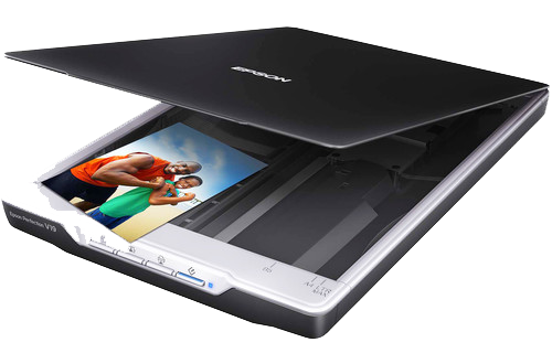
Scanners can capture images at a very high resolution, resulting in extremely large files. It's good practice to scan images into a resolution higher than you need, but not too much larger, or else the files become cumbersome to work with.
What resolution / DPI should I scan in? It depends on several factors:
- The size of the original image
- The pixel dimensions of the video codec the images will be used in (E.g. 1920 x 1080)
- The size of the image when displayed via the video codec
Imagine you have a 6"x4" photo of something you'd like to use in a documentary. You'd like this photo to fill the entire screen of 1080i HD video (1920 x 1080 pixels). Scanning the artwork at 100 dpi would result in a 600 by 400 image- not quite large enough to fill the screen. Scanning it at 200 dpi would result in an image measuring 1200 x 800 pixels. 400 dpi would give you 2400 x 1600 pixels. This is much closer to what you need.
So when scanning always consider the size of the artwork and how large it needs to be displayed within the screen.
Notes on seamlessly merging images:
In order to realistically combine images it's important that they are similar in terms of color, tonal balance and exposure. The angle of perspective should match as well as the angle and quality of light (E.g. key light).
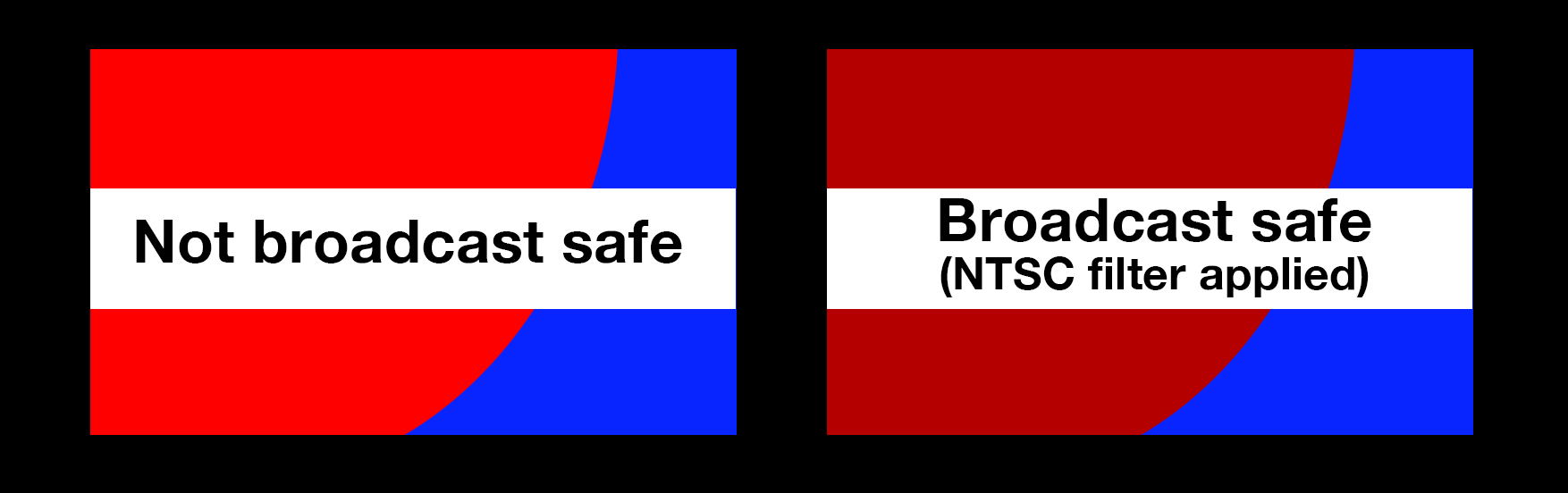
Broadcast-safe colors + monitoring & output
Photoshop can easily create colors and luma values that are outside of the legal range of broadcast video. The filter: Video/NTSC Color will bring the saturdation and luminance into an acceptable (legal) range.
Try adding color to a layer (highly saturated red for example). Check its RGB value. Now apply the NTSC Color filter and check the RGB values again.
In Photoshop, images will always look crisp on your computer monitor. However, after being output, compressed, encoded, decoded, uplinked, downlinked, broadcast, and received, they'll look quite different from how they did on your computer monitor.
To ensure their images will appear properly on TV and that levels are in the legal broadcast range, it's good to work with calibrated monitors and to check your graphic's levels on a waveform monitor.
Some companies make real-time video output devices so you can see your Photoshop or After Effects composition on a video monitor while you work. AJA, and BlackMagic both make IO devices for Apple and PC computers. If you have an external monitor connected to your computer, you can use File > Export > Video Preview to output your graphic.
Channels and Alphas and Bits, Oh My
Video and computer graphics are usually created in the additive color system using three colors: Red, Blue and Green. In Photoshop you can easily see this in the channels window. In fact if you toggle the three channels on and off you may even come to understand that they can be seen as three separate monochromatic images.
Color channels are created automatically by Photoshop when you make a new document. The color mode determines the number of channels. When you start a new RGB image, it creates three channels, one for each color plus a composited RGB channel. If you make a new file in a CMYK color space, Photoshop creates four channels (Cyan Yellow Magenta & Black) plus a composited CMYK channel.
You can view your channels in your image by looking at the channel window in the lower right hand corner of your screen. If you can't see it select "Windows -> show channels"
Alpha channels
Alpha channels define the transparency of an image or video. They can be embedded into certain graphics (such as TIFFs and into certain video codecs (such as ProRes 4444 or Animation RGB+). Alpha channels aren't typically meant to be looked at or admired, but are used to define transparency of a graphcis file. To understand this, it helps to quickly review bit depth, which is how much color information is in an image. 8-bit images contain up to 256 colors or shades of gray (like a GIF graphic). 16-bit images can have thousands of colors and 24-bit images more than 16 million.
The RGB files you create in Photoshop have three 8-bit channels. (3 x 8-bit = 24-bit).
An alpha channel is another 8-bit channel. Think of it as an extra black and white image stored along with your graphic. To make one, simply save a selection or a mask as an alpha channel. In Photoshop you can save selections as alpha channels by looking under "select" -> "save selection". Or you can go to the channel palette and click on the "save selection as a channel" button.
Look at an andrea.tif (sample of a lower third graphic) with an alpha channel. (other sample files: jon.tif and lower_third_temp3.psd)
- Black is transparent
- White is opaque (visible)
- Gray is semi transparent
Since it's an 8-bit channel (think grayscale image), you have 256 steps from black to white. That's 256 varying stages from opaque to transparent.
Adding this additional 8-bit information to your 24-bit image creates a 32-bit image.
An image can have up to 24 channels. (Color or alpha channels) So it’s possible to save multiple alpha channels for varying applications. But while you can have multiple alpha channels in a Photoshop or TIFF document, graphics made to import into Final Cut Pro or Media Composer should only have one alpha channel.
Let's make a key graphic!
Look at examples of keyed graphics. Look not only at their design but where they are placed on screen for their particular purpose. Some have semi-transparent elements. Examples include:
- Title
- ID graphic
- Pop up text message
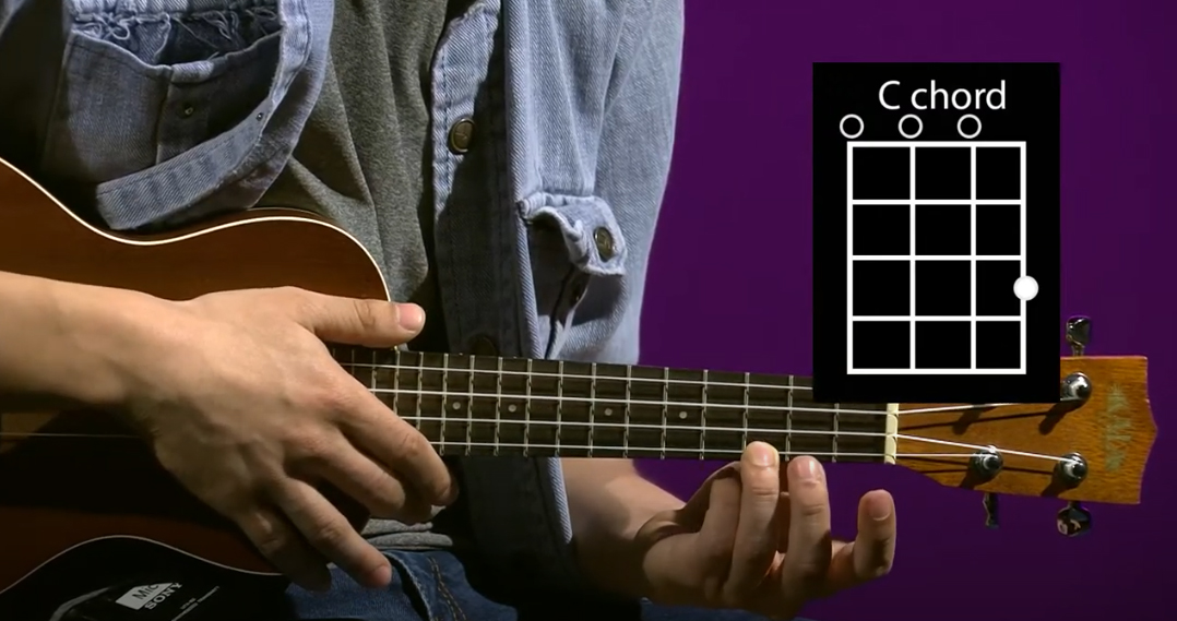
- Chord charts for a music program
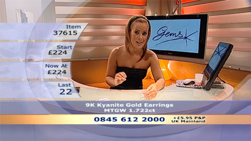
- Product info & number to call
In class "Simple Key" exercise (4 pts):
In this exercise you'll create a simple keyeable ID that follows Jim's Graphic Tips and that be viewed against any background.
- Download the zipped file of interview stills.
- Open them in Quicktime Player and note their codec and pixel dimensions.
- Open Premiere, Media Composer, or Final Cut Pro. Make a new project and import the jpegs.
- Note: If you were actually editing a video project you'd have to make sure your Scratch & Media drives are set to the right place. In the future you'd set this to be your external hard drive.
- Import the jpegs into your project.
- Make a simple keyed graphic in Photoshop to import into your HD project (1920 x 1080). Call it "simple" and make a PNG or TIFF version with an alpha channel. (simple.png or simple tif)
- Import it into your editing program to see how it looks.
- When you are satisfied, upload a copy of your "simple" graphic into the appropriate Canvas assignment.
Straight & Premultiplied Alpha Channels
Alpha channels can be saved as straight or premultiplied. (Aharon Rabininowitz explains the difference)
Straight (also known as unmatted) just uses the alpha channel to determine opacity. The background or matte color doesn't matter. (often looks funky until keyed/composited)
Premultiplied (also known as matted) stores information in the alpha channel, but also factors transparency information into the Red, Green & Blue channels. (looks as it should before being keyed/composited)
Compositing programs like After Effects interpret alpha channels as either straight or premultiplied. Using the wrong interpretation or premultpilying with the wrong color can result in undesirable white fringing or halos around the perimeter of the alpha.
Check out this movie in both Quicktime player and composited in Premiere or AE: QE_Gizmo_loop (from our Meyer textbook)
Using Photoshop's Actions to create an alpha channel:
In Photoshop you can easily make an alpha channel by using the Actions palette. Actions are a prerecorded series of steps you can use that make lengthy procedures simple. Here's how to create an alpha channel using them:
- Make sure that only the layers you want are visible.
- Open the Actions window.
- Open the "Video" actions (accessed by the tiny top right arrow menu).
- Select "Alpha Channel from Visible Layers" .
- Press the PLAY button at the bottom of the window.
Examine the sample headshot and lower third graphic found here. Note that the horizontal highlight bar is semi-transparent. Examine the corresponding alpha channel.
Don't Worry, be PNG-y
Alpha channels have to be created right in order to display correctly. Unless you find them appealing or have a compelling reason to use them, simply use the PNG format to create transparent still images. In Photoshop, your transparent grid should be visible for all transparent areas. The just use the "Save as" command and select PNG as the file type.
In-class Key & Still exercise (6 pts):
- Look at some examples of video lower thirds
- Create a nicely designed 1920 x 1080 keyable lower third ID or title graphic that would show up against any background.
- Make sure it has at least two uses of text, at least two other design components, and something that is partially transparent.
- When you are finished, upload a copy as a PNG (or single-layer TIF with a single alpha channel) into your folder into the appropriate Canvas assignment. Make sure it is called "key".
- Composite the graphic over video or a stll headshot in Premiere. How does it look? Output a JPEG still frame from the timeline to put into your Week3 folder. Make sure it is called "still". (Hint: In Premiere you can output a still frame by clicking on the camera icon below the record monitor.)
Lab 3 Vocabulary Words --------------------------------------------------------
- Alpha Channel - (see above)
- Broadcast safe / broadcast legal video (signal is technically complliant - wiki link)
- Codec – Short for coder/decoder or compressor/decompressor. Manufacturers have unique, sometimes proprietary ways to compress, store and retrieve digital files. Examples include DV, JPEG, Avid, and MPEG.
- Opacity - (the level of transparency. Objects that are 100 percent opaque are solid, objects that are 0 percent opaque are transparent.
- Serif - This is a detail found on the ends of the various strokes that make up a typeface. Examples of seriffed typefaces include Times, Courier and Bookman. This sentence uses a seriffed typeface. Most editors and typesetters think that large printed blocks of text are most easily read using a seriffed font.
- Sans Serif - Fonts that are sans serif (without details) include Arial, Verdana, and Helvetica. Almost all of this page uses a sans-seriffed typeface.
- Transparency - The opposite of opacity. Objects that are 100% transparent are invisible.)
Homework: Graphics Package (due by the start of next week's lab):
Design a graphics package for your own or a fictitious TV talk/news/magazine/reality show. Your graphics package should include 3 1920x1080, single layer, PNG images with some visual/design consistency between the images. (Think repeating colors, visual motifs, fonts, etc.)
- Title Graphic - use to open the show. This graphic needs to contain at least two separate pieces of artwork or images, and any text you want. Please call this "title".
- Lower third ID graphic: This keyable graphic will be used to identify a guest and his/her title/occupation. Your file should be kayable (have an alpha channel). Please call this "key".
- Promo Graphic: This will be used to promote your show. It should communicate the title of the show, when it is on, and a reason to watch. Please call this "promo".
Remember- the design elements need to come from you! The most compelling aspect of the work should be your design- not other people's images or artwork.
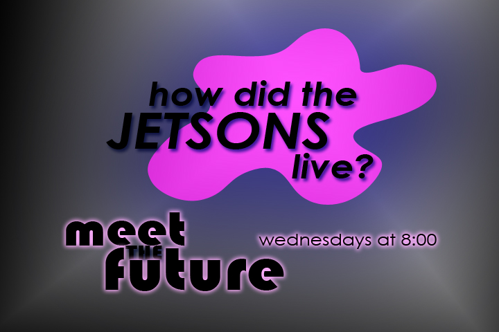
Here's an example (these are 4x3, yours will be 16x9):
 |
 |
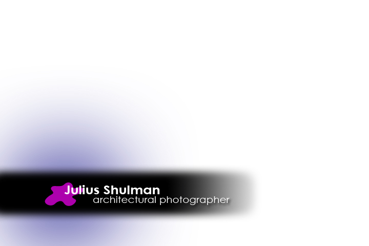 |
Promo |
Title |
Lower third |
Note that the colors and font treatment are similar. All of these images also share the purple blob element.
Don't forget to study for next week's Photoshop Quiz!
