Jim Krause | Classes | P354/J560 Program Graphics & Animation
Lab 2
Agenda:
- Photoshop (continued)
- Clone Tool / Content Aware Fill
- Making Selections & Merging Images
Robin Williams C.R.A.P Recap
- Contrast - Draw attention to the message (not away frrom it)
- Repetition - Repeat visual motifs, colors,
- Alignment - Use alignment to bring order from chaos
- Proximity - Place related elements together
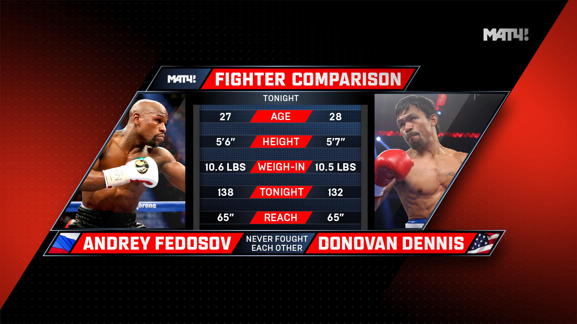
Look to see how aspects of CRAP are applied in the following iimages.


Photoshop Tour and Basic Skills (continued)
Create a simple 1920x1080 TV graphic and be sure you know how to do the following:
- Zoom in and Zoom out
- Use the spacebar to get the hand tool
- Copy a layer
- Delete a layer
- Group layers:
- Link & unlink multiple layers
- Create layer folders
- Adjust a selection's brightness, hue, & saturation
- Adjust a selection's opacity
- Rename layers (You can either Click the layer's title or Change the layer properties by right, or control clicking the layer)
- Apply layer styles (double click on the layer, but not the name)
- Rasterize vector objects & layer styles
- Create text layers in two ways (I beam insertion point and text box)
- Access the character and paragraph panels
- Adjust tracking, leading, and kerning
- Changing baseline, scale, faux styles, etc.
- Resize elements
- Edit -> transform -> scale, rotate, etc.
- Apply a filter to a selection or layer
- Make a selection with the Magic Wand tool (tolerance setting)
- Select a brush/eraser and modify its size and feather
- Use the Clone tool
- Use Content-Aware fill
- Change the pixel aspect ratio (Under "View" menu)
- History - Cmd+Z is go back one step (undo). Option+Cmd+Z will continue stepping back. If this doesn't work: Under Window choose History. This tool keeps track of everything you do and allow you to step back to any point.
Web output:
If you are focused on web output, you'll likely save your image in one of the three common browser-friendly formats:
- GIF (limited color but supports transparency and can be animated)
- JPEG (supports 24-bit color but no transparency)
- PNG (24-bit color AND transparency)
GIFs are 8-bit so can only contain 256 colors. However they do support alpha channels (transparency). GIFs work great for cutout icons with limited colors and transparent backgrounds (like company logos).
JPEGs support 24-bit color but no alpha channels. So while you can't have a JPEG with a transparent background, they are great for high quality images such as photos.
PNGs support 24-bit color and also alpha channels.
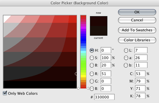
Open the color picker in Photoshop. Note there is a check box in the bottom left hand corner you can select if you want to only see web colors. If you are into HTML coding (E.g. making CSS style sheets) note that the hexadecimal value of the chosen color is displayed near the middle of the window.
ASPECT RATIOS and CODECS - Are You SQUARE?
One job of the graphic artist is to be able to create imagery for a variety of different video formats. Before making any graphics or animations, determine what the video format and aspect ratio are. Some video formats use square pixels while others use non-square pixels. Non-square pixels (shaped like bricks not squares) are typically used with anamorphic formats. These are when the image is stretched to fit into a storage medium with a narrower aspect ratio.
Examples of square pixel formats include:
- Full-raster HDTV codecs, which will either use 1920 x 1080 or 1280 x 720.
Examples of non-square pixel formats include:
- NTSC DV (both 4x3 and 16x9 use pixel dimensions of 720 x 480)
- HDV & XDCam use 1440 x 1080
- DVCProHD 1080 uses 1280 x 1080
ASPECT RATIOS - While standard definition television (SDTV) could be either 4 x 3 or 16 x 9, HDTV is always 16 x 9 (1.778). Films are made and delivered in a variety of aspect ratios. Classic Cinemascope (sometimes referred to as Panavision) is 2.35 x 1- and there are many other formats in use today. If you are interested in aspect ratios, check out this good reference courtesy of Unravel.
- Full frame TV: 4:3 (1.333)
- Wide-screen TV 16:9 (1.778)
- Cinemascope 2.35:1 (2.35)
Fortunately, Photoshop has easy-to-use presets for most common formats, including 4K. Use these presets whenever you can, as they make your job easier. They provide the proper pixel dimensions. safe action and safe text guides, put you in the right color mode (RGB), and will display your work in the proper pixel aspect ratio.
Pixel aspect ratio: Photoshop provides the proper pixel aspect ratio when you create graphics from a template. But Photoshop doesn't always know what to use when opening graphics created in other programs and sometimes the aspect ratio is embedded incorrectly. If the graphic is not displaying properly, change the "Pixel Aspect Ratio" found under the "View" menu.
In-Class Exercise: Clone Tool & Content-Aware Fill (4 points)
- Cut out the Eiffel Tower element from this picture and fill it in using the Content-Aware or Clone tools.
- Fill in the white pillar-boxes at the sides.
- Turn in a PNG to the proper Canvas assignment.
Jim's Nugget of Wisdom (#23):
"He or she who masters making selections in Photoshop becomes a master at Photoshop."
Making Selections and Merging Images
Note: In order to realistically combine images it's important that they are similar in terms of color, tonal balance and exposure. The angle of perspective should match as well as the angle and quality of light (E.g. key light).
In class practice: Making Selections
Download some of the images below to experiment with or find some of your own.
- pic1 (beach and sky)
- pic2 (little girl)
- pic3 (lady sitting on beach)
- pic4 (walking on beach)
- pic5 (beach aqua)
- pic5 (lion)
- pic6 (desert 1)
- pic7 (desert 2)
Practice cutting out people and objects and placing them in other landscapes.
Make sure you try out various selection tools:
- Lasso
- Magnetic Lasso
- Quick Selection
- Magic Wand
There are two good tools in Photoshop that help refine selections and masks:
A few keyboard shortcuts to remember:
- Command + = Zoom In
- Command - = Zoom Out
- Spacebar = Hand Tool (move work area around)
- Command - D = Deselect
- Holding Shift will add to your selection
- Holding Option will remove from your selection
- X will swap foreground and background colors
In-Class "Merge" Exercise (6 points) ------------------------------------------------
- Create a 16:9 TV PNG graphic (1920 x 1080) made up of two images seamlessly merged together.
- Find two images you wish to merge together. Consider lighting, shadow, reflection, etc.
- Save the PSD file you are working on (for future use) and output ("Save as") a PNG graphic to turn in.
- Name your PNG graphic "merge" and upload it to the appropriate Canvas assignment.
Lab 2 Vocabulary Words (know these) --------------------------------------------
- Aspect Ratio
- Pixel Aspect Ratio
- Quick Mask Mode
Homework (due by the start of the next lab):
- Burrows & Wood reading (Chapter 10 PDF file)
- Graphic Analysis: In this exercise you will find and describe and analyze 2 graphics that are used in TV commercials, titles, segues or promos.
- Scan a commercial TV stream (Network, Netflix, Youtube, etc.) and find two examples of graphics that you find pleasing. One should contain simple elements while the other should be complex. The graphics must be formatted for TV/film (widescreen and not a banner ad). Using screen capture software, a digital camera, or your phone, grab screenshots of the two different graphics.
- In a single document (E.g. Word), write a few paragraphs analyzing each graphic. Include your JPEG or PNG screen captures. Consider the following: What was its purpose? What colors were used? What can you say in terms of composition, texture, contrast, font selection, foreground or background elements? Were they effective? Were they pleasing to you? Why or why not?
- NOTE: Please turn in your homework to the proper Canvas assignment in the form of a Word doc, docx, rtf, or PDF.


