

Jim Krause | Classes | P351 Video Field & Post Production
Summer 2018 Week
Agenda/Announcements/Reality Check:
- Tuesday: Cover editing techniques in lecture. In lab we'll cover audio, field lighting, & carry out the News Exercise
- Wednesday: We'll pitch Drama/Storytelling projects and then carry out the Motion Graphics Exercise.
- Thursday: We'll have an abreviated lab so you can shoot your Art Videos.
- Next week: Tuesday we'll have the Midterm Quiz and then review/screen your Art Videos. Thursday we'll cover lighting. Thursday is reserved for you to shoot your interview/feature stories.
- Sign up for your Killer Tracks accounts if you don't have one.
Readings:
- On-line notes (this page)
- Jim's Graphic Tips
- MC Graphics Exercise
- Cybercollege units 37, 38, 39 & 40 (audio)
-
Watch:
Treatments (recap)
Treatments for fiction and non-fiction are similar. The scene is the basic building block. I like to number and name my scenes.
Below is the start of a sample treatment for a 3-minute Interview/Feature story on a sculptor:
Title: Expressions in Clay - The Art of Sally Saunders
Scene 1 - Introduction
Open with a montage of close-ups of ceramic mugs, vases, & bowls cut to the rhythm of acoustic guitar music. After a few seconds of images and music, the cameras pauses on an interesting piece of art. A title appears adjacent to it: "Expressions in Clay". After a beat, a smaller line of text comes in below, "The Art of Sally Saunders".
The montage continues and Sally Sunder's voice comes in, describing the artwork she aspires to create. After a few seconds of voiceover Sally can be seen, seated in her studio. An I.D. graphic is keyed on screen. B-roll is of Sally moving and arranging the artwork in her studio/gallery.
Scene 2 - How it all started
Photo montage of Sally as a young girl. She describes what got her interested in art. B-roll is of Sally starting to work on a piece.
Scene 3 - The Process
Sally describes the process for picking colors and crafting her designs. B-roll is of Sally working on her piece.
etc....
Documentary producers are a bit like attorneys. During the interview/questioning process you pose questions to draw out answers you want. If you have planned propoerly, you should have a pretty good idea of what the answers will be.
Just on the two scenes in the above example you can extrapolate the questions needed:
- Q1: Describe the kind of art you aspire to create.
- Q2: Describe what got you interested in ceramics.
- Q3: Describe your design process.
Editing 102
Editing can be fun or tortuous process. It can be done efficiently or be an incredible waste of time & money.
Learn a few pieces of software. That way you can really understand workflow. To be a good editor you need:
- Understanding of the process & tools. This allows you to focus on the content and being creative. How to get more familiar with the tools? Do the tutorials (again) Edit a lot in your spare time. Make sure you understand where your media is stored. Read the on-line manuals. Go to creativecow.net and read the forums. Spend a lot of time doing it and you'll become proficient. The only way you can get better is to spend time with the tools.
- Your ducks all in a row! Know what you want to do in the edit room before you ever get there. Have your script, footage logs, graphics, and music etc. Minimize the time you spend in an edit session trying to figure out what shot comes next. (This is what should be done in pre-production or at some corner cafe with a mug of your favorite beverage.) When you edit, you should have a plan, or you are wasting your time or someone else's money.
Editing Techniques
A few examples of awesome editing:
- a spanish summer
- The Watchtower of Turkey
- Gulf Oil (Nice match cuts and color grading)
Continuity Editing techniques (See cybercollege 50, 51 & 52):
Transitions - Do you know when to use these?
- Cut - the default transition. Happens in the blink of the eye.
- Wipe
- Dissolve
- Fade
Continuity editing refers to arranging the sequence of shots to suggest a progression of events. This is a simplification. In continuity editing we try to tell a story with many different shots. These shots can come from multiple camera angles in a studio or from multiple segments taken in the field. The idea is to assemble these shots together to tell a story while preserving the illusion of time and space- or manipulate it as we see fit.
Continuity Editing Video Example - (V for Vendetta)
Crossing the Line Example (Matrix/Trinity Escape Scene)
Non-Continuity editing example:
Run Lola Run excerpt
Acceleration Editing
In film and video production time is routinely condensed and expanded. (When you are telling a story, cut out anything that doesn't develop the story or character.) Someone gets a phone call asking him/her to meet. How much do we have to see before he/she meets his/her date?
Expanding Time
Occasionally an editor or director will want to drag out a happening beyond the actual time represented. Expanding time can heighten the suspense. (Think action/adventure movie- A timer on a bomb is counting down to 0. Someone is working furiously to defuse the bomb. We might have 15 seconds left on the timer but the scene can take 1 minute! If the bomb does go off- we see it happen 4 times from different angles)
Causality & Motivation
This aspect of continuity editing addresses cause & effect. As viewers try to figure out the story they look for answers.
Imagine we see a bomb being placed underneath a table in one shot. This is followed by two men sitting down to a picnic table in a park. We cut to a shot of a kid looking up just as they hear an explosion.
While we assume that the two men have been blown up (causality), we still want to find out why (motivation).
Good storytellers will string us along for the length of a movie so we can determine cause and effect.
Relational editing
In relational editing scenes which by themselves seem not to be related take on a cause-effect significance when edited together in a sequence. (Pudovkin's Man in chair intercut with: corpse, bowl of soup, child playing)
Thematic Editing
In thematic editing is also referred to as a montage. (South Park -/- Team America) Images are edited together based on a central theme. In contrast to most types of editing, thematic editing is not designed to tell a story by developing an idea in a logical sequence.
Many different types of montages have been identified and studied. Sergei Eisenstein (Battleship Potemkin) identified various types of montages. Perhaps the best discussion can be found in Zettl's text, "Sight Sound Motion". Zettl identified three types of montages:
- Metric - related or unrelated images used at equally spaced intervals. This can be sped up into an accelerated montage
- Analytical - an event is displayed through thematic and structural elements
- Idea-associative montage - Two possibly unrelated elements are brought together to create a third principle or concept.
One underlying theory that has been applied to montages (and especially related to the last type) is the idea that the whole is greater than the sum of the parts. Juxtaposing two separate elements can result in a more powerful third meaning.
Parallel Cutting (referred to sometimes as cross cutting)
Parallel action takes place when the segments are cut together to follow multiple story lines. These don't necessarily have to happen at the same time.
Parallel editing in the Godfather (example from Critical Commons)
The Opposite of Editing- the Plan Scene
A Touch of Evil - opening scene (Orson Welles)
The Player - opening scene (Robert Altman)
Here's a good look at Pudovkin's 5 editing techniques as explained by Evan Richards. These are: contrast, parallelism, symbolism, simultaneity, and leit motif.
Editing Guidelines (Cybercollege 54 & 55)
Guideline # 1: Edits work best when they are motivated.
Guideline # 2: Whenever possible cut on subject movement.
Entering and exiting the frame. Following the rules of continuity if someone exits the frame on the right to go somewhere, in the next shot we'll see them entering from the left.
Guideline # 3: Keep in Mind the Strengths and Limitations of the Medium.
Remember: Television is a closeup medium.
Maintaining Consistency in Action and Detail. You usually end up with several takes of each scene. Not only should the relative position of feet or hands, etc., in both shots match, but also the general energy level of voices and gestures.
You will also need to make sure nothing has changed in the scene (hair, clothing, the placement of props, etc.) and that the talent is doing the same thing in exactly the same way in each shot.
Guideline # 4: Cut away from the scene the moment the visual statement has been made.
New verses familiar subject matter. New elements need more screen time to give viewers a chance to comprehend them, as opposed to pre-established (or well-known) elements.
Varying tempo through editing
A constant fast pace will tire an audience; a constant slow pace will induce them to look for something more engaging on another channel.
Guideline # 5: Emphasize the B-Roll. An example of this is a feature story revolving around interview. The interview should look and sound strong, but it's the B-roll that holds the viewer's attention.
Guideline # 6: The final editing guideline is: If in doubt, leave It out.
Five Rules for Editing News Pieces (cybercollege)
- Select stories and content that elicit an emotional reaction
- If you have complex subject matter, take your time with it
- While we try to match audio & video, if the video is overly complex, keep the audio simple (and vice-versa)
- Don't introduce important facts directly before strong visual elements. Put them afterwards and they will be remembered better.
- Stick to a beginning - middle - end structure.
Jim's suggestions:
- When using B-roll, don't just use one shot. Always use at least a few shots to make a grouping.
- Shoot shooting B-roll, remember the rules of continuity and shoot "mini-continuity" sequences of shots. (For example if shooting a painter, start with an artfully composed establishing shot. Stay on one side of the line and shoot close-ups of his face, his hands, and his canvas.) These mini-continuity sequences will cut together beautifully as B-roll.
- Cut B-roll on phrases or key words. Try to define a rhythmic pacing of images.
On-line v Off-line editing
- Off-line is not intended for broadcast. You can create a rough draft and/or an EDL
- On-line produces the broadcast master
Setting Proper Exposure (aperture control)
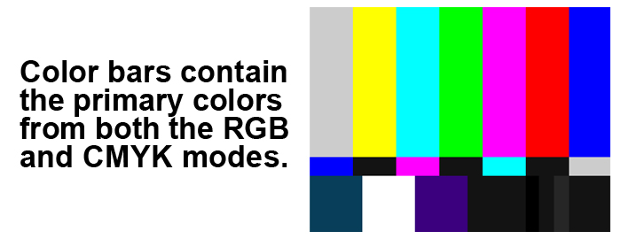
Monitors are nice but never trust them until you see color bars through it first. The same applies for viewfinders. Always check out the appearance of color bars through your viewfinder before using it to adjust the iris.
Waveform monitors display brightness/luma information and can be built into camcorders and incorporated into field monitors. The major levels to be aware of are:
- 0 IRE - For the darkest (blackest black) portions of your video
- 100 IRE - For the brightest portion of the screen (E.g. white, fluffy clouds on a sunny day)
HD SMPTE color bars generated from your camera should look something like this:

On a waveform monitor this is how they'd appear:
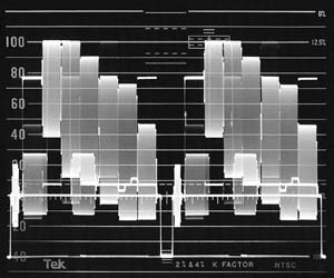
Note the IRE values of the various colors. Remember that the maximum legal, allowable value for broadcast video is 100 IRE. The blackest black for digital video is 0 IRE.
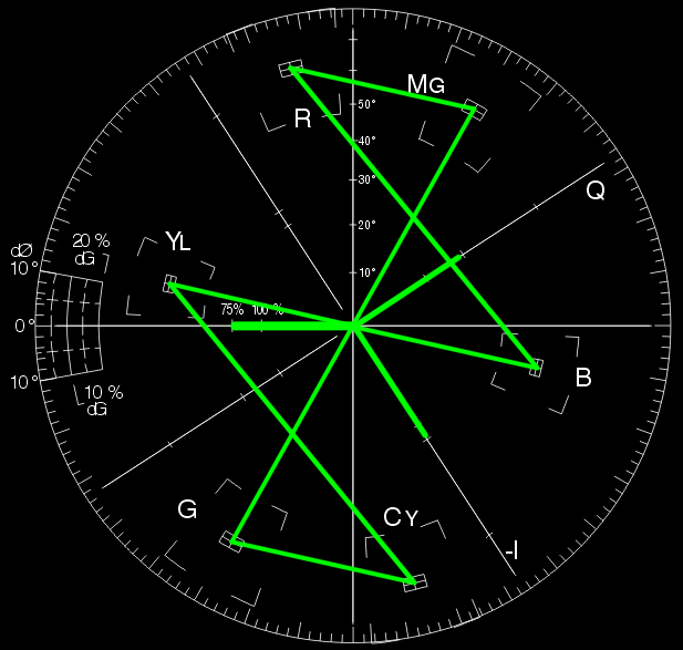
While waveform monitors are helpful, they aren't always available in the field. This is one reason it's good to have the zebra stripe function on a camera.
Zebra Stripes
Zebra stripes are a visual aid that helps the camera operator set the proper exposure. (A switch on the Sony Z1Us and Z7Us will turn the zebra stripes on or off in the viewfinder.) Zebra stripes become visible when a certain IRE (luminance) value is reached. You can adjust the threshold luminance level through the camera menu. Don't use zebra stripes unless you know what they are set for.
Finishing Avid Media Composer Exercise:
Finish editing Storyboard / Continuity Sequences. Be sure that they:
- Are edited and output in HD
- Start in black and end in black
- Have at least one additional stereo audio track with at least one fade
FCP/Premiere/Media Composer editing. Students should know:
- Use the Razorblade tool
- Use the Roll and Slip tools
- Adjust audio levels and use the Pen tool to add keyframes for fades
- Add tracks
- Assign tracks
- Add effects
- Load a clip in the browser and modify it using crop, blur, move, move, etc.
- Link/unlink audio
- Make a freeze frame
- Export a still frame
- Import graphics and audio
- Set In points and Out points
- Add black at end of project
- Export a movie
Color
Color can be objectively described in a number of ways. One of the most common methods is using the HSB model:
Hue (the actual color)
Saturation (the strength or intensity, or how far it’s removed from gray)
Brightness (how dark or light)
Color Modes
But you can also describe color in other ways- depending on what color mode you are working in. Two color modes you should be familiar with are:
Additive Color (RGB)
Subtractive Color (CMYK)
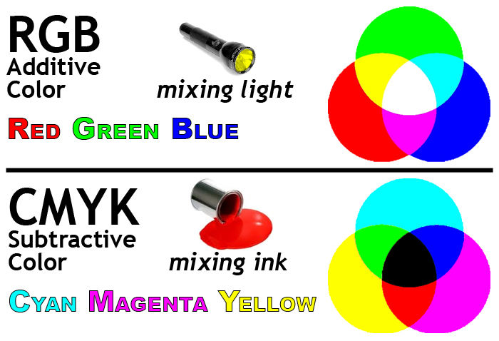
Additive Color is the color system used for computer graphics, TV and lighting design. This is the color mode used to create graphics for TV and web. It's referred to as additive since lights are mixed or combined to make the various colors.
- Red
- Green
- Blue
The primary colors (think of them as light sources) are:
Mix them together and you get white.
Subtractive Color is the color system used for printing. It's referred to as subtractive because the colors absorb (subtract) some light and reflect others.
- Cyan
- Magenta
- Yellow
The primary colors (think paints or inks) are:
Mix them together and you get black. (K stands for "key" or black plate.)
Bitmap and Vector graphics
Bitmap or raster images, use a grid or array of pixels to represent an image. The grid is made up of squares or pixels. Each pixel is given a specific color and brightness. If you enlarge a bitmap graphic, you will eventually see the grid.
Digital photos, scanned images, and captured video frames are by neccesity bitmap graphics.
Vector graphics are made up of shapes, lines and curves that are defined mathematically.
When you draw a circle or create a piece of text with a vector-based application (such as Adobe Illustrator), it keeps track of the lines and angles that make up objects. From this mathematical data, it draws the display. We can scale a piece of vector artwork up to any size, and it will still retain its quality.
Fonts or typefaces are examples of vector graphic objects. You can scale fonts up as much as you want and the edges will never become jagged.

Anti-aliasing
You can turn this feature on and off. It produces intermediately shaded pixels to smooth out the appearance of jagged edges. Note the anti-aliasing which is apparent on the enlarged image on the right hand side.
Text
Text is the most important element used to convey information in graphics. Whether a lower third, the price of a product, stock market figures crawling across the screen, or the final scrolling credits at the end of a production, knowing how to properly use text is essential to graphic production.
It's also possible to make compelling pieces of art based primarily on text. Check out these examples:
- http://vimeo.com/3829682 ("Like, you know" written by Taylor Mali)
- http://www.youtube.com/watch?v=6mnvvVi4HaI (based on Lock, Stock & 2 Smoking Barrels dialog)
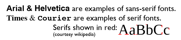
Serif and Sans-serif
Serifs are small details found on the end of some fonts. In typography we can describe a font as either serif or sans-serif. (Sans means without.)
Arial and Helvetica are examples of sans serif typefaces.
Times and Courier are examples of seriffed typefaces.
Typographers generally believe that large blocks of text are more easily read by using a seriffed typeface. This is why books, newspapers and magazines primarily use seriffed typefaces in the main body of text.
Tracking, kerning & leading
Tracking refers to the horizontal spacing of an entire group of letters on the same line.
Kerning is the space between individual letters. For example you’d want to kern a small case letter “o” to fit underneath the capital letter “T”.
Leading (pronounced like bedding) is the vertical spacing between lines of text.
![]()
Terms you should know:
- Anti-aliasing
- Bitmap or raster image
- CMYK (subtractive) color mode
- HSB - Stands for hue, saturation and brightness. Used to identify a color. Hue, (sometimes thought of as tint) is the actual color, saturation (sometimes called chroma) is the amount of color present (no saturation or chroma means the image is B & W), and brightness, which is how light or dark the color is.
- Leading
- Kerning
- RGB (additive) color mode
- Vector image
- Sans-serif type
- Serif type
- Tracking
Back to Jim Krause's Summer P351 Home Page
